Automatic alignment of containers within a certain area. Like CSS FlexBox in Web.

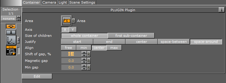
Interface description
The script uses a bounding box from Size container to build a space/field for child containers.
It's possible to switch between X and Y as the main axis by Axis param.
Size of children helps you to control how will be calculated the bounding boxes of items. "Whole container" just consider bounding boxes of each item-container. But, "first sub-container" allows you to control this size manually through the dimensions of the first child container of each item-container. With the second option, the animation can be more smoothly and more controllable. You even can animate this "first sub-container".
Justify works like in HTML/CSS flex.
Align works along the secondary axis. If you select X as the first axis, the second will be Y.
Shift of gap and Magnetic gap allow you to control aesthetic factors of appearance. How items look when items count is few or many.
Min gap is like a threshold for minimal gaps. If the gap should be less the value it becomes to zero! It allows avoiding very tiny gaps between items what can look like cracks.
Do you know about “flexbox” in HTML5/CSS3? This is a flexible box layout for convenient auto-placing of containers into a bounding box of the certain container. Take a look at explanation of the idea for web.
Let me introduce several features I’ve implemented for convenient usage in onair graphics: “justify-content” and “align-items”. This script can be helpful in many situations.
All possible variants
I’ve marked my two often used options by blue strokes.
X axis:
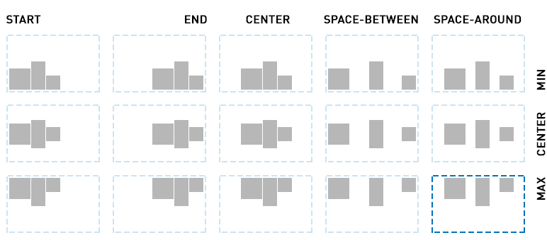
The marked variant is very useful for portraits with different height when you need only top alignment among all pictures (and no requirement for bottoms to be aligned).
Y axis:
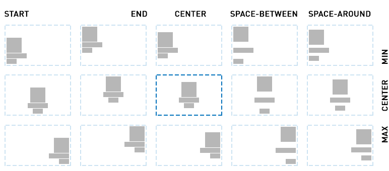
The marked central variant is useful for fast centring of any logo with a sign.
Cases for flex-positioning
The first idea for using a flex is a simplification of containers positioning within certain area.
Flex is used in onair graphics as auto-stack. For example, for:
- set of portraits or infographics bars
- enlarging one element and auto moving away from others
- stack of messages in a corner
- set of lowerthirds in a corner
You can also combine Flex with scripts and plugins:
- nested Flex into another Flex — horizontal and vertical ones
- combine with my script "Autoscroll" — use Flex for containers stacking and use Autoscroll for a convenient scroll of content
- of course, feel free to use any standard plugins :)
Esthetic options
Magnetic
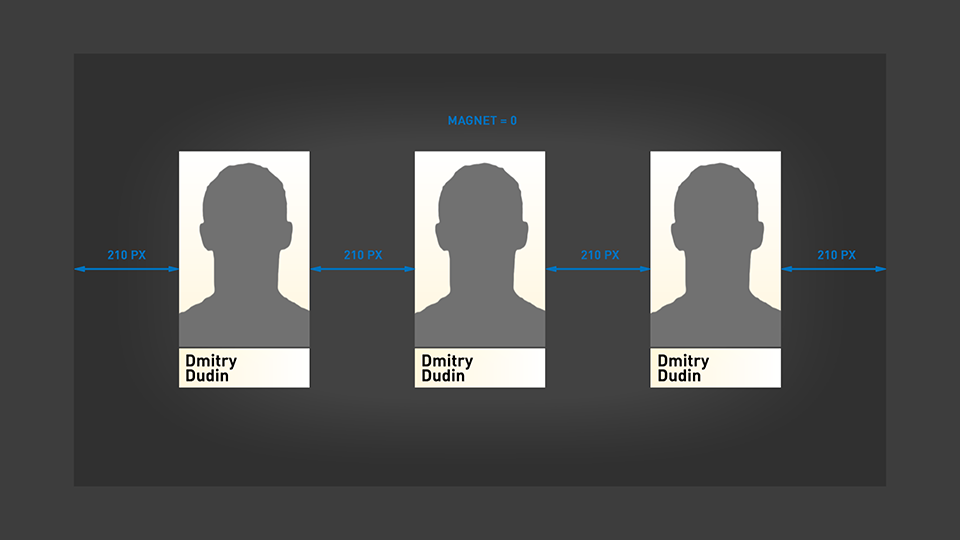
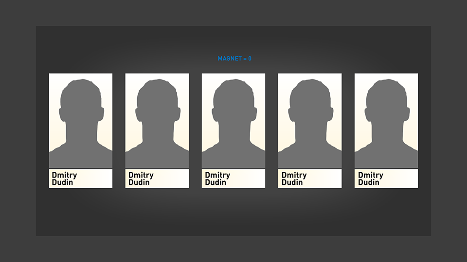
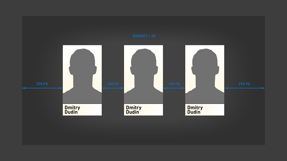
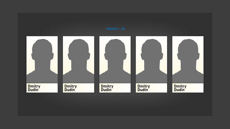
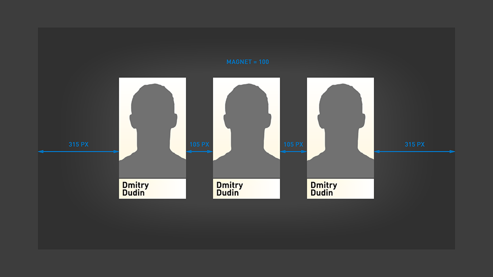
For esthetic reasons, I’ve added a special parameter for correction of distribution within a certain area. Imagine that you have fullscreen graphics with several portraits. It’s possible to show 1 to 5 items. You set “justify-content” in “space around” and get a nice result for 1, 4 or 5 visible items. However, in the case of 2 (or 3) portraits, there will be too much space between them. With correct logic 2 (or 3) items will have equal distance between themselves and area borders. That doesn’t look good. That’s why I’ve implemented the “magnetic” feature for pulling effect when a number of child containers is small.
Compare 0, 50, 100 values of magnetic with 3 and 5 items:
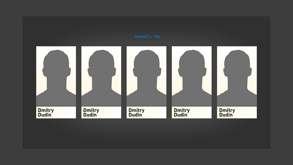
Source of item size
If items have animations with changing size, you can get unexpected behavior. Items could start jiggling. If you don’t want this effect, you can limit the source for calculating an item’s bounding box by first sub-container. This first sub-container can be invisible (but active) and static for stable positioning. Or you can softly animate this container in order to reach nice revealing animation.
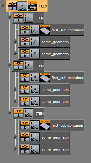
Both options are good and can be useful. You can select what you need.
Unobvious using approaches
Feel free to experiment with this script.
Scaling item
You can change the size of items separately:
Nested flex
You can nest one flex inside another ;)
Example scene
FlexExamples.viaIt contains an old version of the script, please update the code in the scene by "Copy script" button.